
How the eye moves. What the research says.
Eye tracking studies, typographic science, and cognitive load frameworks explained in plain terms for web publishers.
The F-Pattern
Eye tracking evidence from text-heavy pages
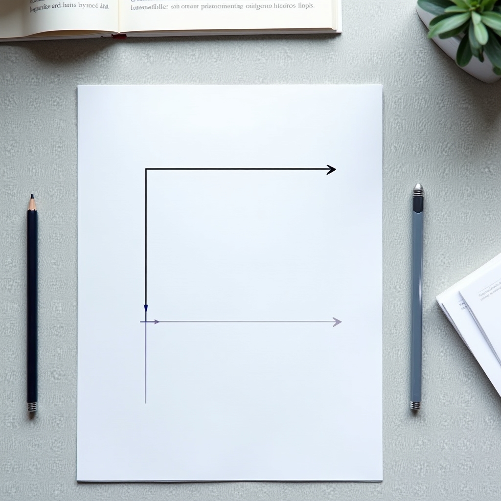
The F-pattern was documented systematically by Nielsen Norman Group researchers who tracked the eye movements of participants reading text-heavy web pages. The pattern takes its name from the shape the eye traces across a page: two horizontal sweeps across the top of the content, followed by a vertical movement down the left side.
The first horizontal sweep tends to cover the most ground. The reader begins at the top left and moves right, reading a substantial portion of the first line. The second sweep begins a short distance down and covers less horizontal territory. After that, the eye typically drops down the left margin in a vertical path, catching the beginnings of lines without reading across them in full.
This pattern has implications for where information is placed on a page. Content positioned in the upper left is seen by nearly all readers who encounter a page. Content positioned in the lower right may be seen by a small fraction. The left margin of any page receives more attention than the right margin, which means the beginning of each line carries more cognitive weight than the end.
It is worth noting that the F-pattern is not universal. It appears most reliably on pages with continuous text and no strong visual breaks. Pages with images, clear subheadings, or pull quotes can disrupt the pattern and redirect attention. The pattern describes a default scanning mode, not an inevitable one.
The Z-Pattern
Scanning behavior on visually structured pages
Where the F-pattern emerges from dense text, the Z-pattern appears on pages with more visual structure and less continuous text. Landing pages, homepages, and pages that combine images with short text blocks tend to produce a Z-shaped scanning path.
The Z-pattern begins at the top left, moves horizontally to the top right, then drops diagonally down to the bottom left, and finally sweeps right to the bottom right. This path traces the letter Z. It is a faster, less thorough scan than the F-pattern and reflects a reader who is oriented toward finding a specific element rather than reading comprehensively.
Understanding which pattern a given page is likely to trigger has structural implications. If the Z-pattern is the expected scanning mode, placing key information along the Z-path increases the probability it will be seen. A call to action in the bottom right, for example, falls at the natural endpoint of a Z-scan. A headline at the top left is the starting point.
Designers have applied this framework to landing page layouts for decades. For writers, the more relevant insight is that page structure shapes scanning mode. A page broken into clear sections with visual anchors invites Z-scanning. A wall of text invites F-scanning. Neither mode is reading in the full sense of the word.
Typography and Time on Page
What font choices do to reading duration
Readability research has a long history, much of it originating in print contexts. The challenge for web publishers is translating that research into screen-appropriate guidance, because screens present text differently than paper does.
Font size research consistently identifies a range below which reading becomes noticeably effortful. For body text on screens, the commonly cited lower boundary in readability studies falls around 16 pixels. Below that threshold, the cognitive effort of decoding the letterforms competes with the effort of processing meaning. Readers who experience this friction tend to leave pages sooner. The relationship between font size and time on page reflects this: more legible text holds attention longer, not because readers are passive, but because the text is not creating unnecessary work.
Line spacing, or leading, has a similar relationship with reading ease. Research in this area generally supports a line height between 1.4 and 1.6 times the font size for body text. Lines that are too close together make it difficult for the eye to track back to the correct line after reaching the end of a line. Lines that are too widely spaced create a page that feels sparse and may signal to the reader that the content lacks density.
Line length, measured in characters per line, is a related variable. Lines that are too long cause the eye to lose its place during the return sweep. Lines that are too short interrupt reading rhythm with constant returns. Readability research from both print and screen contexts tends to converge on a range of approximately 50 to 75 characters per line as comfortable for sustained reading.
Body text at an appropriate size with adequate line spacing creates a reading experience that requires less conscious effort. The eye can process words in groups rather than decoding letter by letter.
Smaller text at tighter spacing creates friction that competes with the cognitive work of understanding meaning.

Cognitive Load in Reading
How working memory shapes what readers process
Cognitive load theory, developed by educational psychologist John Sweller, describes the demands that learning tasks place on working memory. Applied to reading, it offers an explanation for why certain content formats produce better comprehension than others.
Working memory is limited. It can hold and process a small amount of information at once. When a reader encounters unfamiliar vocabulary, complex sentence structures, or poorly organized information, a portion of their working memory is occupied with navigating the text itself. Less capacity remains for understanding what the text means.
This has direct implications for web writing. Dense paragraphs with multiple embedded clauses, jargon that requires definition, and organizational structures that are not immediately apparent all add to the cognitive load a reader must carry. The reader may understand each sentence individually but struggle to integrate the meaning across a long passage.
Simpler sentence structure, clear paragraph-level topic sentences, and explicit transitions between ideas reduce the cognitive overhead of reading. This does not mean simplifying ideas. It means reducing the structural complexity that wraps the ideas. A complex argument presented in clear, well-organized prose places less cognitive load on the reader than the same argument presented in dense, structurally complex writing.
The connection to web reading behavior is that readers who experience high cognitive load are more likely to abandon a page. The effort of reading becomes disproportionate to the perceived value of the information. Reducing load does not guarantee retention, but it removes one of the most common reasons readers leave.
See How This Applies to Solo Publishers
The frameworks above take on different meaning when the publisher is also the writer, editor, and designer. A separate section addresses that context.
For Solo Marketers